


The Ambition
How does data becomes the clarity healthcare needs?
Lorem ipsum dolor sit amet, consectetur adipiscing elit. Suspendisse varius enim in eros elementum tristique. Duis cursus, mi quis viverra ornare, eros dolor interdum nulla, ut commodo diam libero vitae erat. Aenean faucibus nibh et justo cursus id rutrum lorem imperdiet. Nunc ut sem vitae risus tristique posuere.
My+
Brand Development / Brand Identity / Key Messaging / Visual Identity / Graphic Design / Visual production /Photography / Marketing / Social Media / Video Industry: Health Industry
Industry: Health Industry
Video Container
The Ambition
Market’s first viable Diagnostics Intelligence
Moving from a Nordic diagnostics system to an internationally scalable intelligence platform required more than a product launch. It required building a new category from the ground up, before the market had a name for it.
Category creation at this scale means convincing a market to organise around something new. That takes more than a strong product. It takes a brand, a language, and a system that makes the category feel both inevitable and ownable.

“Lorem ipsum dolor sit amen. Phasellus sapien erat, pretium tempor pharea sed, gravida et. Phasellus sapien erat, pretium temporpharetra sed, gravida et.”
– Hannele Tirronen, Mylab
Video Container
THE STRATEGY
Defining a category before the market knew it needed one
The opportunity wasn’t to launch a product. It was to define a category. My+ is unified Diagnostic Intelligence that improves healthcare’s efficiency, clarity and impact from decision-making to patient care. One intelligence, every level.
My+ is unified Diagnostic Intelligence that improves healthcare's efficiency, clarity, and impact from decision making to patient care.
A clinician gets clarity at the point of care. A laboratory gets streamlined workflows and faster answers. A healthcare system gets diagnostics that learns and scales. One intelligence, every level.
My all in vital decisions.
Video Container


My all in vital decisions
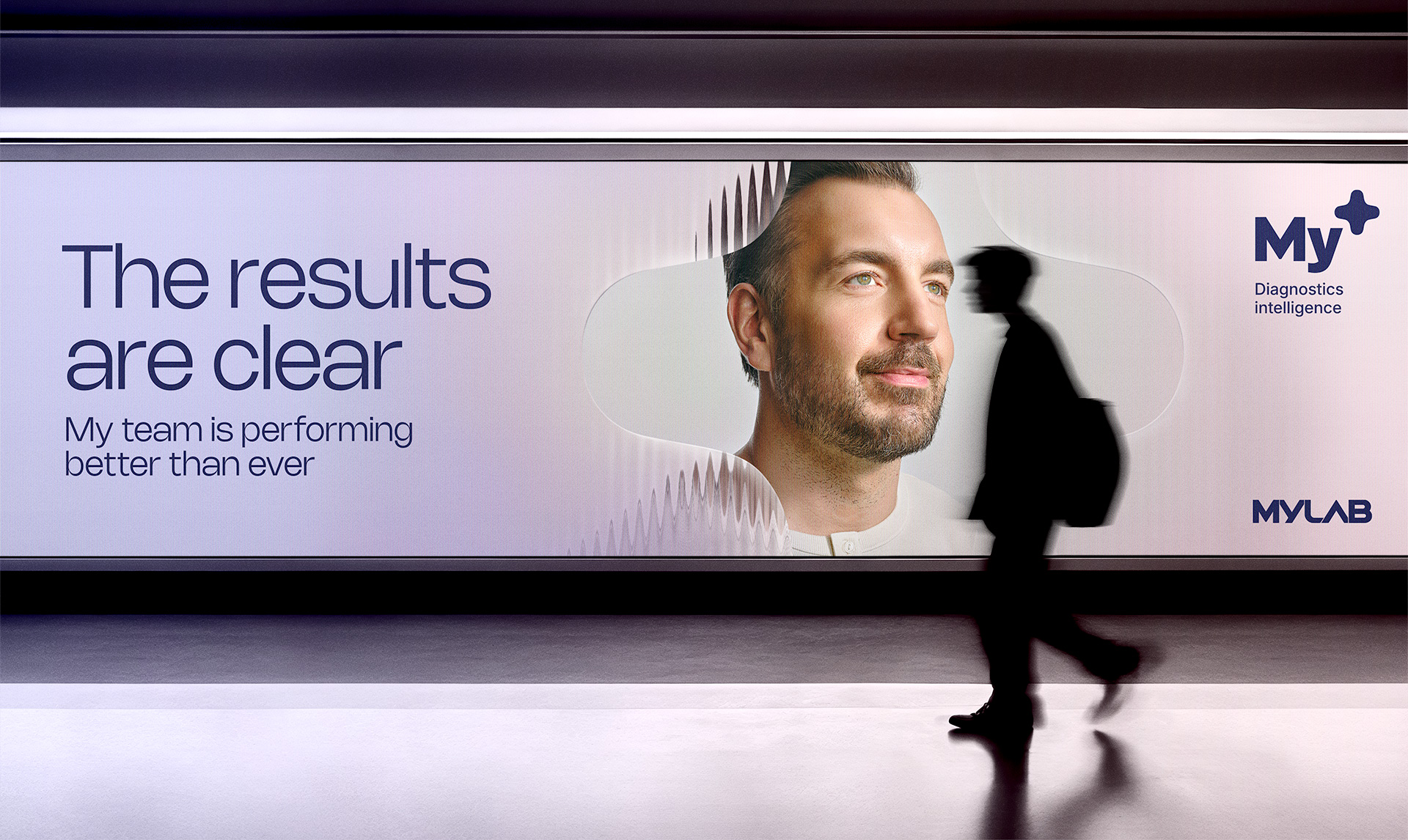
“My all in vital decisions” connects every audience to a single human truth: that the value of intelligence is only realised at the moment of decision. The key visual translates this directly. The image moves from distortion to clarity, with the My+ symbol acting as the agent of that transformation.
Rather than a campaign, the brief called for something more durable: an executable Playbook with targeted messaging, visual assets, and practical guidelines to make always-on marketing easy and efficient. To sidestep the common traps of localisation, messaging was developed simultaneously in several languages from the outset.
“Lorem ipsum dolor sit amen. Phasellus sapien erat, pretium tempor pharea sed, gravida et. Phasellus sapien erat, pretium temporpharetra sed, gravida et.”
– Hannele Tirronen, Mylab

THE DESIGN
A symbol made dynamic, a brand made international
The work extends the newly developed Mylab brand rather than replacing it. The illustrative plus symbol was elevated from a supporting asset to the brand’s crown jewel: a dynamic, living entity that reflects diagnostic data as insights across every audience level.
We equipped Mylab with brand photography and motion graphics style. The photography featured different levels from hero to supporting imagery to fully bring their offering and messaging to life in visual assets. With motion we emphasised the clarity and transparency that My+ brings to complex data handling.
The work extends the newly developed Mylab brand rather than replacing it. The illustrative plus symbol was elevated from a supporting asset to the brand’s crown jewel: a dynamic, living entity that reflects diagnostic data as insights across every audience level.


Video Container

How big
can you get?
How big
can you get?
Ready to find out the impact your brand has on the business? Book a session with us.
.png)
Your submission has been received!
How big
can you get?
We will contact you shortly.